Towers of Power – IMEI & “Built to Last”


The built to last reading seemed to really drive home a concept I’ve heard repeated multiple times, which is that a good idea is secondary to the organization and persistence that goes into making it a reality. As the author listed off numerous examples relating to the theme of – Don’t just tell time, build a clock – I kept wondering how modern tech companies, and their “leaders”, would be judged with this frame work. Apple for instance, seems as though it could fit into either category (visionary success vs. more conventional success). Similarly I wondered how modern data might confound some of the categorization that the author made. Some companies like Walmart have since seen their preeminence degrade while others like Hewlett Packard have since become nearly iconic failures of management and innovation. Citibank too was almost completely wiped out in 2008 while its “control group” alternative Chase seems to have claimed the mantle of most admired. I think the point of the first two chapters was well taken but I am often suspicious of business writing like this. My suspicion comes partly from the fact that I’m not sure if there is useful advice on how to start a generic company. I don’t deny the value in having some business education but as the author points out many of the most prominent business people in the world had no background in business planning or business school. There are so many factors that determine a companies success that it seems like a very difficult thing to model (especially when your units of data are bookshelves and . Furthermore, there is the issue of cherry picking winners and data availability. How many visionary companies for instance didn’t make the author’s list because its founder chose outcomes besides scaling up and remaining independent. Or because time, place and circumstance closed the doors available to budding entrepreneurs…. Either way I did enjoy reading these accounts of how these big name companies stated and thrived, I just wonder about the blind spot in studies like this.


IMEI:

I was able to get my phones IMEI number fairly easily. At first I found it in the settings menu on my iPhone but later realized its written on the back of my phone. The IMSI was tricker – I didn’t get it exactly – I ended up calling AT&T customer service who told me that they had, never heard of an IMSI, then found it in my account and had to ask their boss whether it can be given out. They eventually told me that they can’t give it out to me on the phone but that it could be found in/written on my SIM card. I get the sense that I could figure it out based on other ID numbers on my phone but couldn’t figure exactly where it would come from.

Designing for Digital Fabrication Final

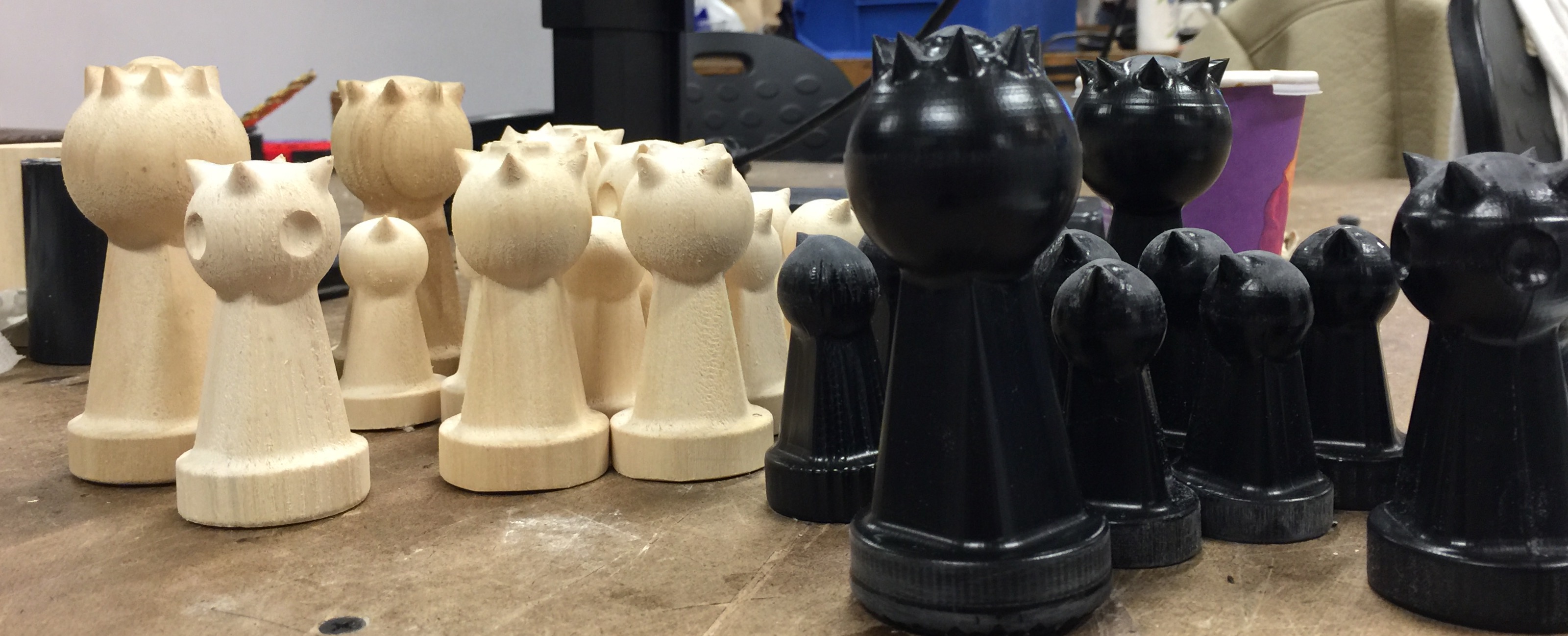
For my final design and fabrication project I decided to design and fabricate my own chess set. I developed the design offer the course of a few days. The basic shape is a sphere on top of a skinny pyramid with a round base. This basic frame comes in three sizes to represent each “class” of pieces (eg. Pawn, knight, king). I decided after I made this basic frame to differentiate the pieces according to how they move on the board. As such the points on the head of each piece indicates the general movement pattern of that character. So the pawn has one point facing forward while the queen has eight points facing in every direction.

Then I had to decide how to fabricate these pieces. I wanted them to be solid and ideally somewhat heavy so I figured I could use the 3D printer or the 4Axsis mill. I went with the 4Axsis mill because I had just learned how to use it a week earlier and it offers a wide range of materials to work. The 4 Axis also offers the ability to test a bunch of different materials and see how they work out. Ultimately I cut half a set in soft wood and almost half a set in black delrin.

Ideally I would have had the time to cut one side out of white delrin and one side out of black delrin and the wood would have been a test version but the 4-Axsis takes approximately 1.5-3.5 hours per piece. I completed 29 pieces and ran out of time. Another issue I ran into was that the delrin would warp under the pressure of the mill if I was cutting too many pieces at the same time (in an effort to reduce waste material). I eventually figured out how to correct for this issue by cutting in stages, but this added even more time and could introduce errors of its own. That being said I am really happy with the delrin pieces that made it and the design. I’ve learned how to use the 4 axis mill pretty thoroughly and by virtue of spending a lot of time in the shop, I’m a lot more comfortable with all the machines in general. However if I were to repeat this project I think I would instead send the file out for 3d printing and/or casting. The 4-Axsis is great for prototyping and provides high quality results but when constant attendance is required it just isn’t economical time wise.


Art Strategies – Final

As I mentioned in my previous post for my Art strategies final project I wanted to continue working with systems art and traffic routes. In this case we were also asked to consider a critical use of spectacle in our work.

fullsizerender

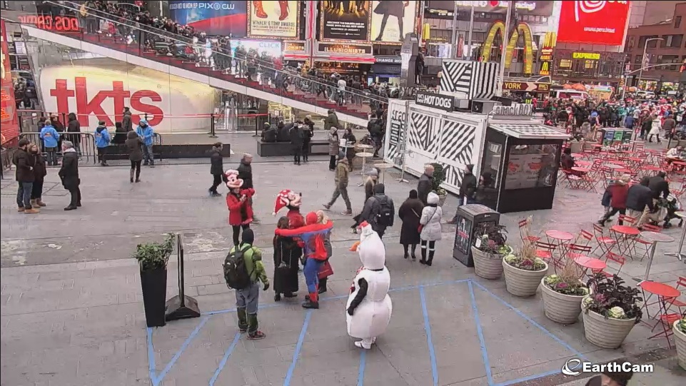
In my mind Times Square stands out as an intentional spectacle. To millions (billions?) of people this place  and the image of it represent New York City. However if New York City is a spectacle in in itself, as I believe,  TSQ is a fairly poor representation of that. My goal with this final project was to make a sort of Times Square-esq spectacle out of the lives of real individuals who live here. To make a truer representation of NYC. To make the case that the city itself, and the people and places who make it are where attention should be paid, rather than the baubles set up for visitors.

Basically, I wanted big lights for the big city that said something other than “buy American apparel” and “share this with your friends”.

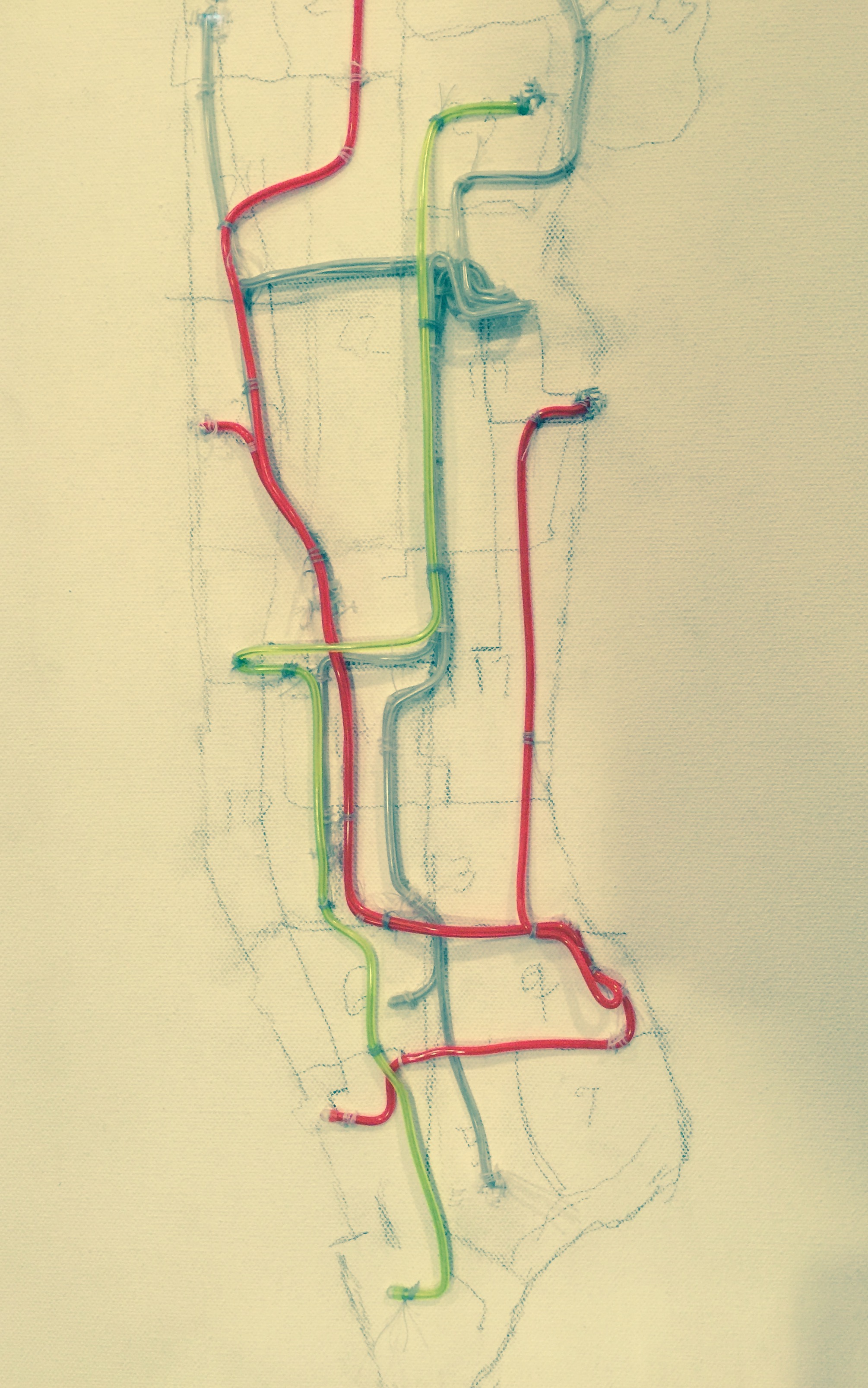
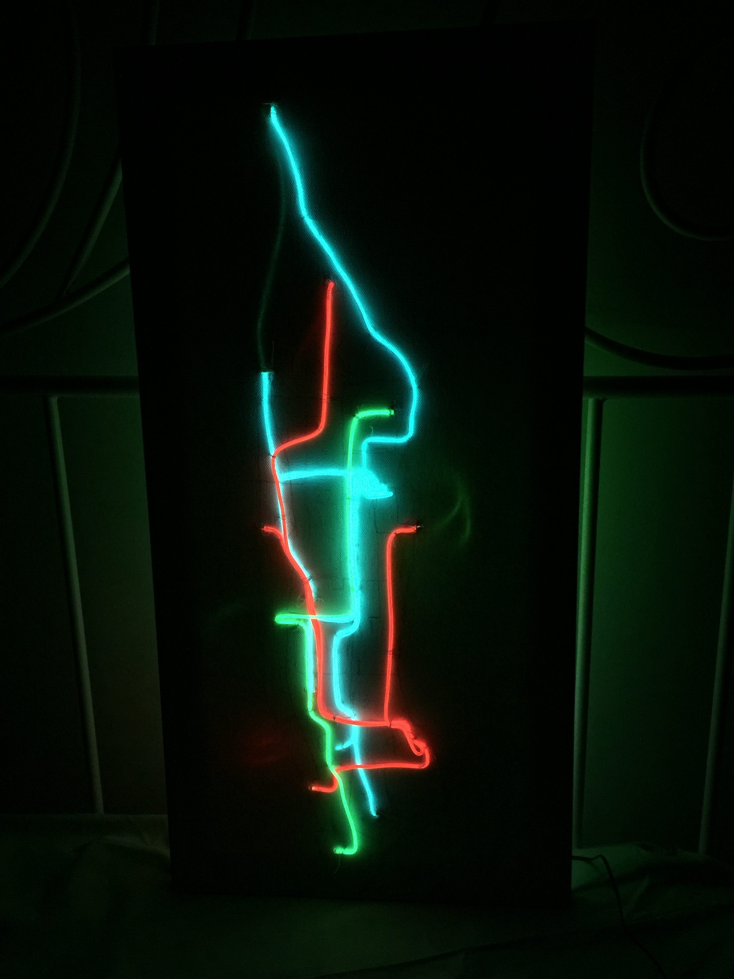
The final vision for this project entails a large canvas that moves to various buildings/locations throughout the city and documents the travels of regular visitors/residents. At each location a map of New York is projected onto the canvas and the various destinations and routes are traced in EL wire (or some equivalent lighting technology). Hopefully this can be displayed in a common area, like a lobby, as that buildings routes are being added. As the canvas moves to new locations in different neighborhoods the routes begin to crisscross and pile up, creating a realistic representation of density and interconnectedness of otherwise disparate personal paths. Ideally each origin point (where the work is temproraily displayed) and it’s respective routes would be represented in a different color so that they are distinguishable across the map.  Each line would also be set on a timer to light up at the rough start time of each commute/journey, stay on for the usual duration of this trip, and then turn off. This creates a cyclical, blinking, light up board that creates a similar visual effect to TSQ advertisements.

Here is an image of the prototype (no blinking yet):

img_3743

The piece would stop traveling to different buildings and neighborhoods once a map/image of New York is easily recognizable through EL wire alone.

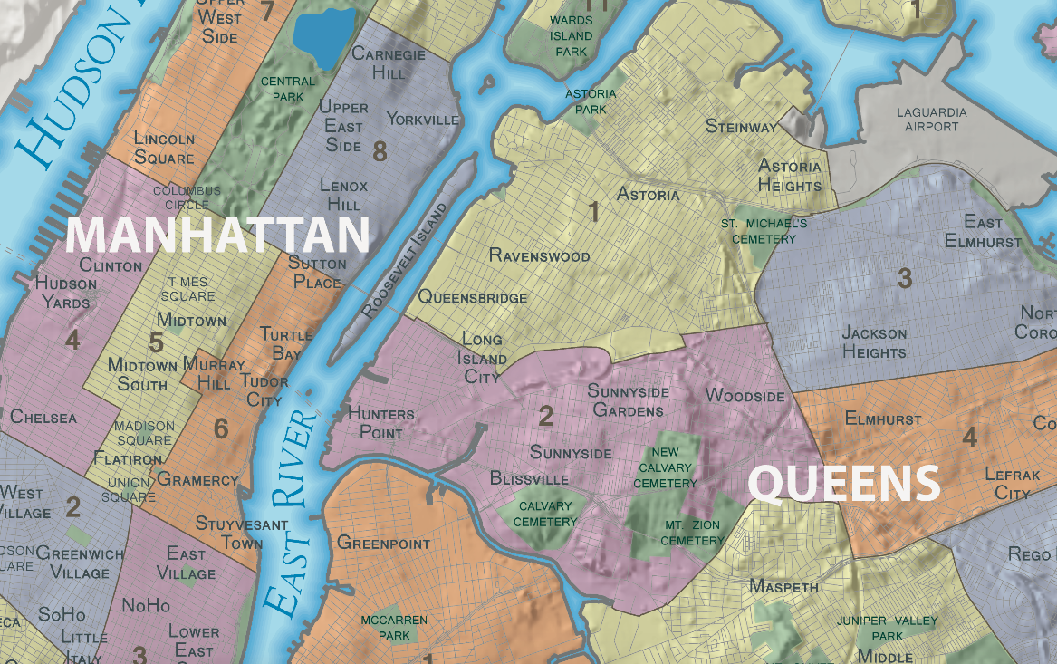
A major concern with this work was making sure I use a system to select which buildings I would set this up in, and what order. At this point I think It would visit and map from buildings in each of the city’s 59 community districts (which roughly correlate with neighborhoods) and the order of these would be selected randomly. Within each neighborhood I think I would try to identify buildings that are within the median height, use and age for the neighborhood and find property owners or residents from that list that would be accommodating. Basically I want to work in a typical building for each neighborhood. I would then trace the paths of as many people as volunteer within each building, I may also pay participants for their involvement.

screen-shot-2016-11-30-at-1-02-32-pm

Ultimately I think this map will include trips to work, school, grocery stores and doctors offices and will involve a wide enough spectrum of people to be familiar to the vast majority of NYers. The process of this work can also be repeated with different building selection, cities, and should be relatively easy for an “unskilled” person to complete so theres a lot of opportunity for iteration in this work. I like this project because it literally highlights the ways in which mundane individual decisions, together, build the tremendous spectacle of The City.

Art Strategies Final Proposal

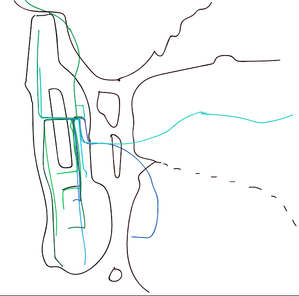
For my Art strategies final project I’d like to continue to work in a similar theme to what I’ve made previously involving routes and paths through cities (mostly new york). I’m thinking it will be a sort of neon sign sign for my apartment building. I’m planning to use EL wire sewn onto a canvas to create a map of routes that people in my building frequently take (maybe to work, school, or a friend’s house). This is roughly what it may look like:screen-shot-2016-11-16-at-11-38-48-am

I’m hoping that the physical EL wire looks good when bunched up on the canvas to add weight to common routes. I found a similar use of EL wire in Anna Madeleine’s Submarine Cable Map (2016):

Submarine Cable Map
Submarine Cable Map

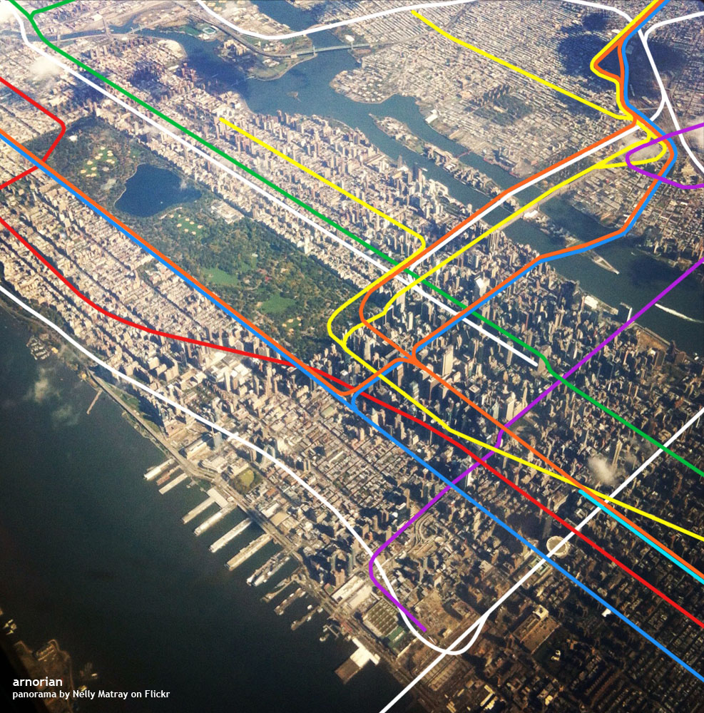
At this point I’m unsure of what else I’d like on the canvas. I’ve considered a simple reference map like I sketched out in the first image or maybe a full arial photography. I really like how these images look with the subway lines superimposed:

By Arnorrian
By Arnorrian

I’m going to post a sign up sheet in my building to collect some real destinations but failing that I’m going to try to make them up based on real data.


Additional thoughts:

Like a neon sign for beer in a bar window. This is what this apartment building has!

I think of this as presenting a “chicken/egg” question in reference to housing, place and identity or the idea that the destinations construct the origin.

Visualizing individual routes in the same way we might view subway lines is interesting to me – its sort of like using a microscope on urban transit issues.

I’d like to make a series of these on the same canvas. I think it could be really interesting to add new buildings and their associated routes to this over time. It would create multiple hubs and interwoven spokes that would make the people flows more distinct and make the broader system I am referring to clearer. This is especially interesting with no base map. How many buildings would I have to add before the form of New York becomes obvious? Is New York defined by the paths we carve through it?

Questions:

How big should this be?

What about the basemap?

Would other interactivity add anything to this?

How do I solicit this information from my neighbors?

Are there questions I need to ask myself about this?