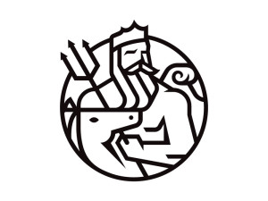
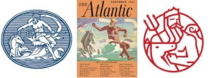
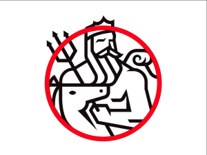
For my Visual analysis I choose to focus on an image of Poseidon as (one of) The Atlantic’s logo(s). I thought this would be a good place to start. This is a symbol I always liked and I thought that despite its simple appearance it was probably developed very carefully as the modern face of The Atlantic.

(http://wapo.st/1MEwz15)
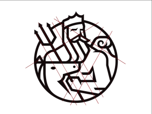
I noticed three or four grid patterns: the first I noticed was a diagonal XY grid represented by the intersection of Posdeions trident and his shoulder. The second was another rotated grid intersection at the wave and the other shoulder.
(I thought this grid might be very dense so I only included enough lines to make the pattern recognizable)

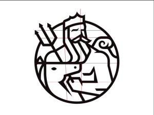
Then I saw the horizontal and vertical grid seen on the left sided of posdeions head (y-axis) and the top of the horses(?) head (x-axsis).

lastly, the cirlce contains most of the scene which may not be a grid but seems to “rationalize” the image and add depth as the head and trident break out of it.

There are relatively few objects in the image and they all serve to relate the logo to the original and clearly provide all the elements necessary to conclude that the figure is posideon : the pitchfork, crown, wave, and long beard are all classically used to signify this character. I’m not sure about the horse/unicorn but I assume that’s there to either keep it consistent with the original or refers to another classical element that I’m not aware of.
Each of these elements is arranged in a series that creates a sense of depth despite the fairly uniform line thickness and the single shade of black. The horse head is layered over posideons left arm and pitch fork, while posideon himself is effectively in front of the wave.
The circle border heightens both the ease of recognizing this character, a crown and pitchfork may be enough for some people, as well as the sense of depth and action. I feel like posideon is just itching to fully emerge from the circle and attack the kinds of dense policy and cultural questions The Atlantic often wrestles with. It also allows the image to be read from left to right, so it can sit neatly above or adjacent to the text based logo or an article. It’s also worth mentioning that the thick black lines over white make this graphic easy to apply to a magazine cover with almost any other color or image underneath it while remaining distinct and recognizable.
