Color Composition | Visual Language #6

This week we were asked to look into color composition. Being a very colorblind person I wasn’t sure how successful I’d be at this but I ultimately realized that I can leave some color decisions to the color wheel and have a reasonable expectation that they would “work” as a composition even if I could’t see it properly. Taking the color perception test was interesting too because I actually felt like I was doing a decent job until I got a score at the bottom of the perception range.

Screen Shot 2015-10-26 at 10.37.42 AM

The funny thing about being colorblind is that its hard to notice until someone tells you. If this challenge lacked a score I would have felt pretty confident that I did well. I think that this is the primary frustration with this minor disability, it’s existence is largely social.

When trying to create a composition I tried to rely on some of the color relationships we learned about on the color wheel. I made a weather displaying sketch that changes color (and some other properties) as we weather and time of day changes. The range of hues is determined by the temperature where I mapped a range of 0 to 100 degrees to 0-330 degrees on the color wheel. The background is then set as an adjacent color by adding 30 degrees and the boarder is set as the complement of the background. Here are some of the ranges with a fixed saturation and brightness.

Screen Shot 2015-10-26 at 10.41.15 AM Screen Shot 2015-10-26 at 10.40.49 AM Screen Shot 2015-10-26 at 10.40.34 AM Screen Shot 2015-10-26 at 10.40.21 AM

Next I varied some of the brightness levels of the background to correspond with the day/night cycle:

Screen Shot 2015-10-26 at 10.42.10 AM Screen Shot 2015-10-26 at 10.41.58 AM Screen Shot 2015-10-26 at 10.41.41 AM

I didn’t want it to ever get completely black so I set the range of the background and border to vary between 50-100 brightness depending on how far away from mid-day it currently is. Lastly, I adjusted the saturation of the background and border. I wanted the circles to be the primary temperature indication so I set the saturation of the background to 50% and the border to 25% while leaving the dots at 100%. Screen Shot 2015-10-26 at 10.43.02 AM

I hope that this isn’t a totally weird collection of colors 🙂

Screen Shot 2015-10-26 at 11.15.54 AM Screen Shot 2015-10-26 at 11.15.43 AM Screen Shot 2015-10-26 at 11.15.26 AM Screen Shot 2015-10-26 at 11.15.13 AM Screen Shot 2015-10-26 at 11.14.58 AM


https://11bsouth.com/DataBouceTemp/


Logos | Visual Language #4

Part One: We were asked to look into a logo that we liked so I chose Bucky badger, the mascot of the University of Wisconsin.

BuckyBadger.svg


I know a lot of people from Madison, Wisconsin and they all have some strong feelings one way or the other about this character so I thought it would be a good logo to read up on. While Madison had a mascot as early as the 1930’s the badger named “bucky” or “Buckingham U Badger” was developed in 1940 by a commercial artist named Art Evans from California. Initially it was used primarily by semi-affiliated bookstores and institutions.


The University is a major employer and source of recreation and entertainment for Madison so even today Bucky can be found selling everything from popcorn to used cars.


Bucky also has many permutations depending on the department or sports team that is using it:


The “modern” logo came into existence in 1988 from the Anson W. Thompson Company of Los Angeles.


This logo was the first that the university itself attempted to form a trademark around which led to University Book Store v. University of Wisconsin–Madison Board of Regents where a trademark was awarded. Having been to Madison many times the badger is used as frequently as the statue of liberty is in NYC. It’s interesting that this particular logo actually started as a community development and became and official emblem of the college. In 2003 the logo was updated to give it more scalability, and to reenforce the university’s ownership of the image.


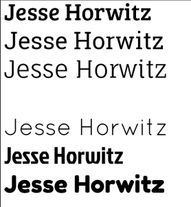
Part 2: The second part of this weeks assignment was to develop a personal logo. This was the first assignment where I really tried to learn illustrator so I didn’t get too ambitious with custom graphics. Here are some of my ideas and attempts:

Screen Shot 2015-10-13 at 12.51.56 AM

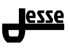
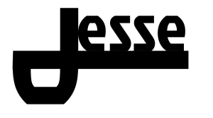
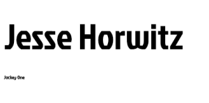
I tried to make the “J” in Jesse serve as the primary element of the logo. However I had a hard time getting things to look right with the font I selected. I ended up with two decent versions in this font (Jockey One): Screen Shot 2015-10-13 at 1.07.04 AM

Screen Shot 2015-10-13 at 1.05.16 AM


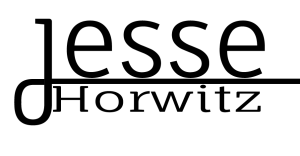
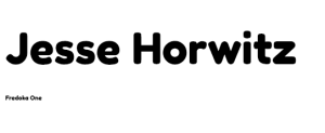
I tried this kind of logo again in a different font (Fauna One) and added my last name:

Screen Shot 2015-10-13 at 1.30.32 AM

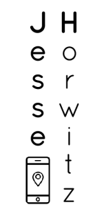
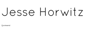
Eventually I got kind of frustrated with the “J” look so I wrote my name in Quicksand vertically with some varying stroke weights and used the spacial imbalance between my first and last name as a place for interchangeable icons from the noun project.

Screen Shot 2015-10-13 at 11.08.25 AMScreen Shot 2015-10-13 at 11.03.47 AMScreen Shot 2015-10-13 at 11.02.25 AMScreen Shot 2015-10-13 at 2.06.28 AM

Credits for the noun project images: misirlou, Minna Ninova,

Signage | Visual Language #2

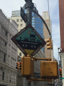
This week we were asked to look more closely at signage around NYC in order to identify what makes a good sign vs. a bad sign. The first sign I wanted to share was this one that hangs in multiple places around the 3rd avenue & 60th street intersection (right in front of Dylan’s Candy Bar):

IMG_1515


This is a fairly dangerous intersection because there is a lot of bus, truck, and pedestrian traffic moving around. The proximity to the Queensboro bridge, a handful of express bus stops and the Lexington ave – 59th street subway station produces overcrowding on all the transit infrastructure here which unfortunately  seems to make most people more aggressive in their movement. To make matters worse Dylan’s Candy Bar generally caters to busloads of kids at a time and has very little sidewalk space to support this. It makes sense then that the city or some organization put this Be Aware, Be Patient, Be Sober, Cherish Life sign around this intersection. However I think this sign does slightly worse than nothing to help the situation. First of all the most basic problem is that it is oriented towards a building rather than at any lane of car or pedestrian traffic. Cars can absolutely not see this sign but its height, size and language indicate that it was meant for drivers. Though even if it were oriented at the cars I doubt it would do much besides add a distraction from the intersection they should be focused on. The red (I’m colorblind) band around the sign with fully uppercase, diagonal lettering would both attract attention like a stop sign and then be totally illegible to a driver at any sort of speed. At the same time the entire center of the sign is more folk art than than information system. Overall I think this project should have been a mural or something other than a road sign.

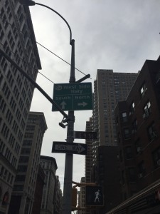
IMG_1516


I spotted this sign on 9th street and broadway near ITP. I don’t have quite as much to say about this one. What struck me here was that the west side highway is quite far away from this sign and to me this sign indicates proximity. I think the goal here is to move traffic over to the west side before it hits Houston or Canal street but this seems to risk getting people lost in the grid. I think the problem is that it suggests that this is the point of decision making for someone trying to get on the highway. Maybe I’d have a different perspective if I drove this route.


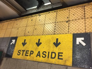
IMG_1467

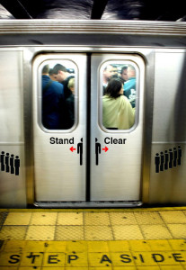
This sign is trying to convey a message that should easily be required reading for anyone within 100 miles of NYC: Let people off the train before attempting to enter. A simple concept, often flouted, leads to much acrimony. This sign is ok but I think it could be much better. The color, arrows and bold text make it clear that there is a call to action and hopefully “step aside” would make that clear. However the distance from the train confuses. This is especially true when the train is not in the station since the white arrows might actually encourage someone to stand in the worst place possible. I tried to replace or supplement this sign by adding some language to the subway doors themselves. subway_doors_stand_clearMy hope is that when someone first sees the step aside prompt it becomes overwhelmingly clear what they should do when the train finally arrives. In my mock up I wrote “stand clear” on the doors (in Helvetica) to emphasize that you shouldn’t stand in front of them, while echoing the vocabulary used in the subway announcements. I also downloaded some “sign people” from a free vector image site and placed a sign person split by the subway doors with opposing red arrows with the idea that it could convey a “people will be exiting” kind of message. Then I put a “waiting in line” type row of sign people on either side of the doors to demonstrate a good place to wait as others exit the train. I considered some more text and other symbols but in the end I thought a simpler message would be best, especially in the context of a train that is trying to arrive and depart swiftly.
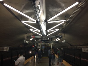


 

Finally, I found a sign I liked.

IMG_1489I liked this series of signs because of the way they communicate distance. This is on the Grand Central platform of the 7 train, which is one of my favorite stops in NYC. The distant places are high up and somewhat father to either side. Although this may in some cases indicate greater importance I think here it effectively tells you that you need to go around these staircases to get the escalator, for instance. Meanwhile as you approach the staircase the smaller sign become the only one visible and clearly labels where the staircase goes without confusing it with the messaging on the larger higher level. I liked this approach because most people walking down this platform have plenty of time to decide where there going and with these signs the information becomes available as you need it. I have some issues with the exact words and uses for these sign points but overall I thought the system used here was cool.

Design Analysis – The Atlantic’s Poseidon | Visual Language #1

For my Visual analysis I choose to focus on an image of Poseidon as (one of) The Atlantic’s logo(s). I thought this would be a good place to start. This is a symbol I always liked and I thought that despite its simple appearance it was probably developed very carefully as the modern face of The Atlantic.

theatlantic_poseidon

colophon
 (http://wapo.st/1MEwz15)

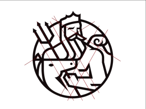
I noticed three or four grid patterns: the first I noticed was a diagonal XY grid represented by the intersection of Posdeions trident and his shoulder. The second was another rotated grid intersection at the wave and the other shoulder.

(I thought this grid might be very dense so I only included enough lines to make the pattern recognizable)

Screen Shot 2015-09-21 at 12.49.09 AM


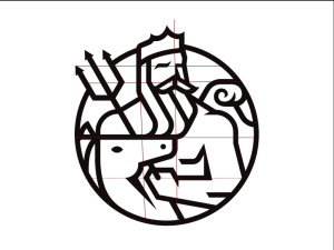
Then I saw the horizontal and vertical grid seen on the left sided of posdeions head (y-axis) and the top of the horses(?) head (x-axsis).

Screen Shot 2015-09-21 at 12.50.49 AM

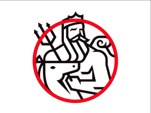
lastly, the cirlce contains most of the scene which may not be a grid but seems to “rationalize” the image and add depth as the head and trident break out of it.

Screen Shot 2015-09-21 at 12.44.18 AM

There are relatively few objects in the image and they all serve to relate the logo to the original and clearly provide all the elements necessary to conclude that the figure is posideon : the pitchfork, crown, wave, and long beard are all classically used to signify this character. I’m not sure about the horse/unicorn but I assume that’s there to either keep it consistent with the original or refers to another classical element that I’m not aware of.
Each of these elements is arranged in a series that creates a sense of depth despite the fairly uniform line thickness and the single shade of black. The horse head is layered over posideons left arm and pitch fork, while posideon himself is effectively in front of the wave.
The circle border heightens both the ease of recognizing this character, a crown and pitchfork may be enough for some people, as well as the sense of depth and action. I feel like posideon is just itching to fully emerge from the circle and attack the kinds of dense policy and cultural questions The Atlantic often wrestles with. It also allows the image to be read from left to right, so it can sit neatly above or adjacent to the text based logo or an article. It’s also worth mentioning that the thick black lines over white make this graphic easy to apply to a magazine cover with almost any other color or image underneath it while remaining distinct and recognizable.