Art Strategies – Systems, Maps, Ethnography, Infrastructure

I’ve been interested in “density” as a characteristic of place since I was first introduced to the term. After reading the material for this week I realize that in someways I’ve really been interested in the system(s) of density for as long as I can remember. To this day I like to play city building games with the goal of creating as layered and self-contained of a metropolis as possible. Following this interest into the realm of known artists I remembered an architect named Paolo Soleri. Soleri is know for, among other things, his interest in “arcology”, a structure meant to host “very densely populated, ecologically low-impact human habitats”.


Babel IIB

Many of Soleri’s Arcology concepts appear in his book Arcology – City in the Image of Man (1969). The goal of these arcology was to provide a model for an alternative system of sustainable urban development and generally human life.

“Soleri bases his entire arcology neither on economic, social, or  industrial considerations but on a philosophical system. It is so all-embracing in its scope that it relates the arcological city unity to the entire evolution of organic life, from the proto-biological  primordial ooze to an as yet unevolved Neo-Matter …. Insisting that nature and human evolution work as vectors or parallel  progressions, he ties the future fate of mankind to the same  increasing complexification that has marked the rise of our organism  from the amoeba.”  —Sibyl Moholy-Nagy The Architectural Forum, 1970

The term arcology, which Soleri coined, is a portmanteau of “Architecture” and “Ecology”. Through Donella Meadows’ identification of leverage points this seems like a great (though apparently unsuccessful)  attempt to change the paradigm of urbanization, as these renderings, “take you outside the system and force you to see it whole.”

Ultimately, I am a bit conflicted about Soleri’s arcology. On the one hand this does seem to satisfy a desire for efficiency and system awareness that I feel is sometimes lacking in environmental or urban focused work. In addition, I think that there is a general bias, at least in the US, against large scale urbanization and planning that something like this requires. So I think mapping out a series of habitats like this is important. It communicates the subtle idea that humans don’t necessarily have to be in nature to work with nature. And that the systems that make existing cities so productive culturally, economically and politically can be harnessed in an intentional and pointed way. On the other hand, these arcology can be seen as further obfuscating the already “unconscious” role infrastructure plays in our lives and would deny the largely self organizing qualities of our existing urban systems. Either way, Arcology – City in the Image of Man is a totally beautiful book and Soleri’s ideas have spawned a whole community dedicated to this kind of vision.


Works consulted:

https://en.wikipedia.org/wiki/Arcology

https://en.wikipedia.org/wiki/Paolo_Soleri
Home

Obituary


Art Strategies | Procedural Art Prototype

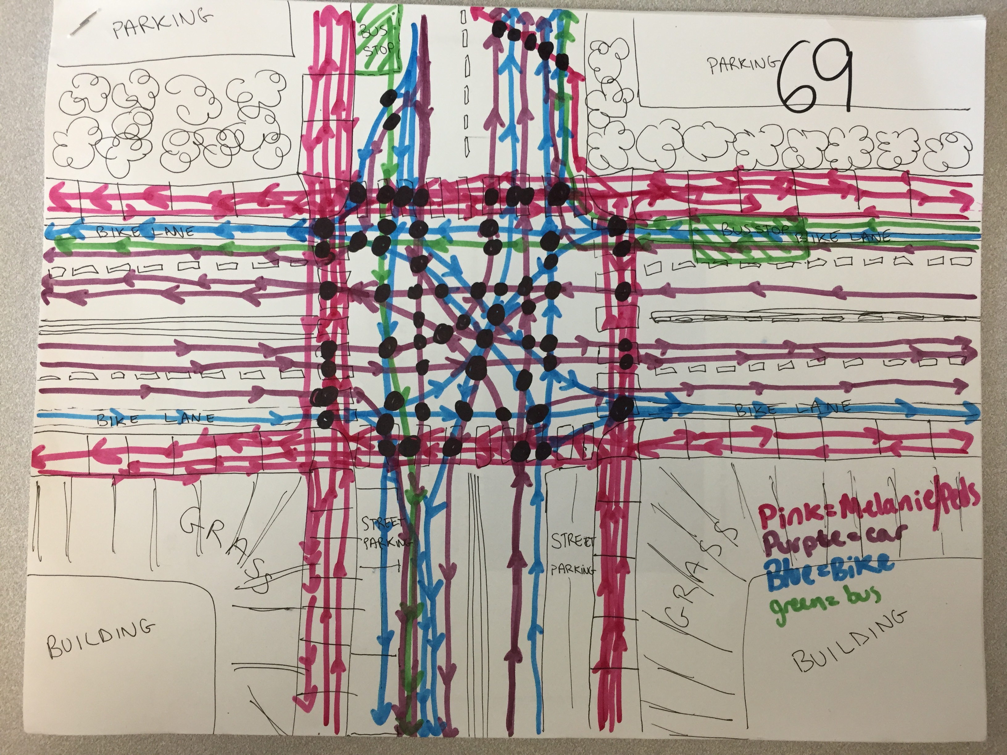
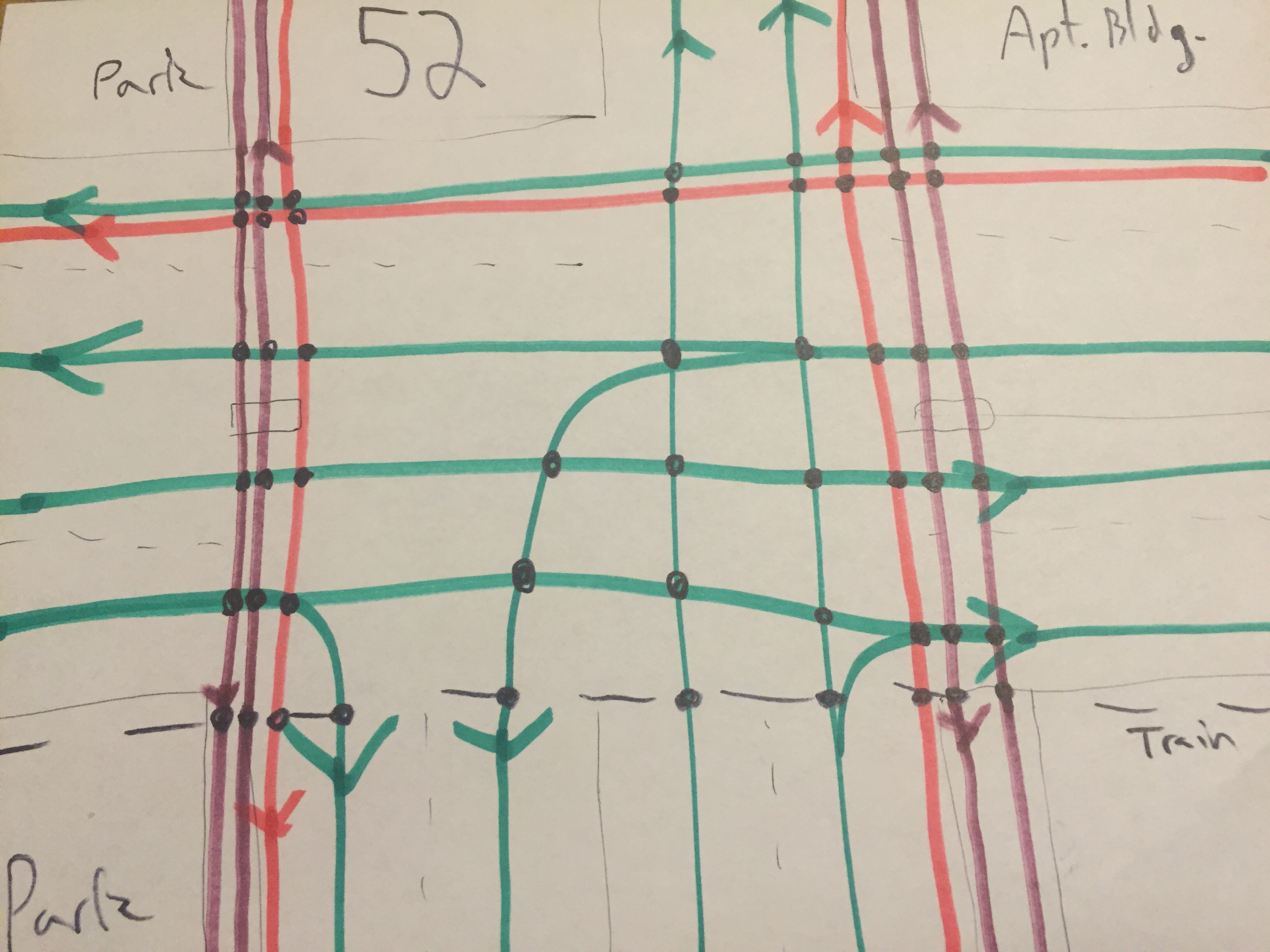
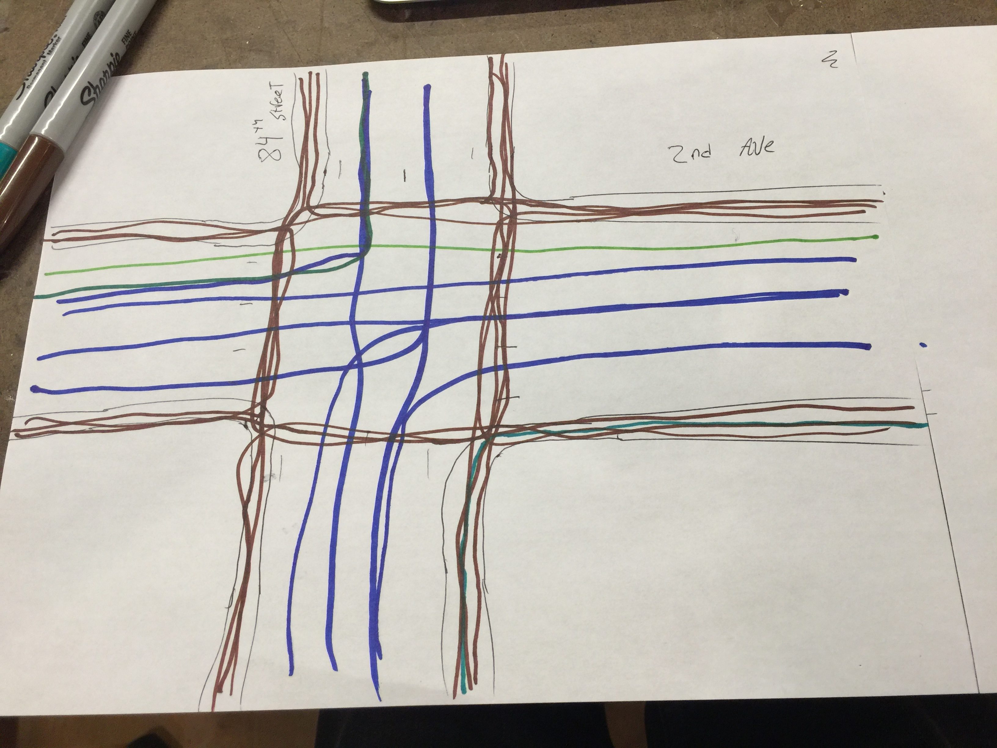
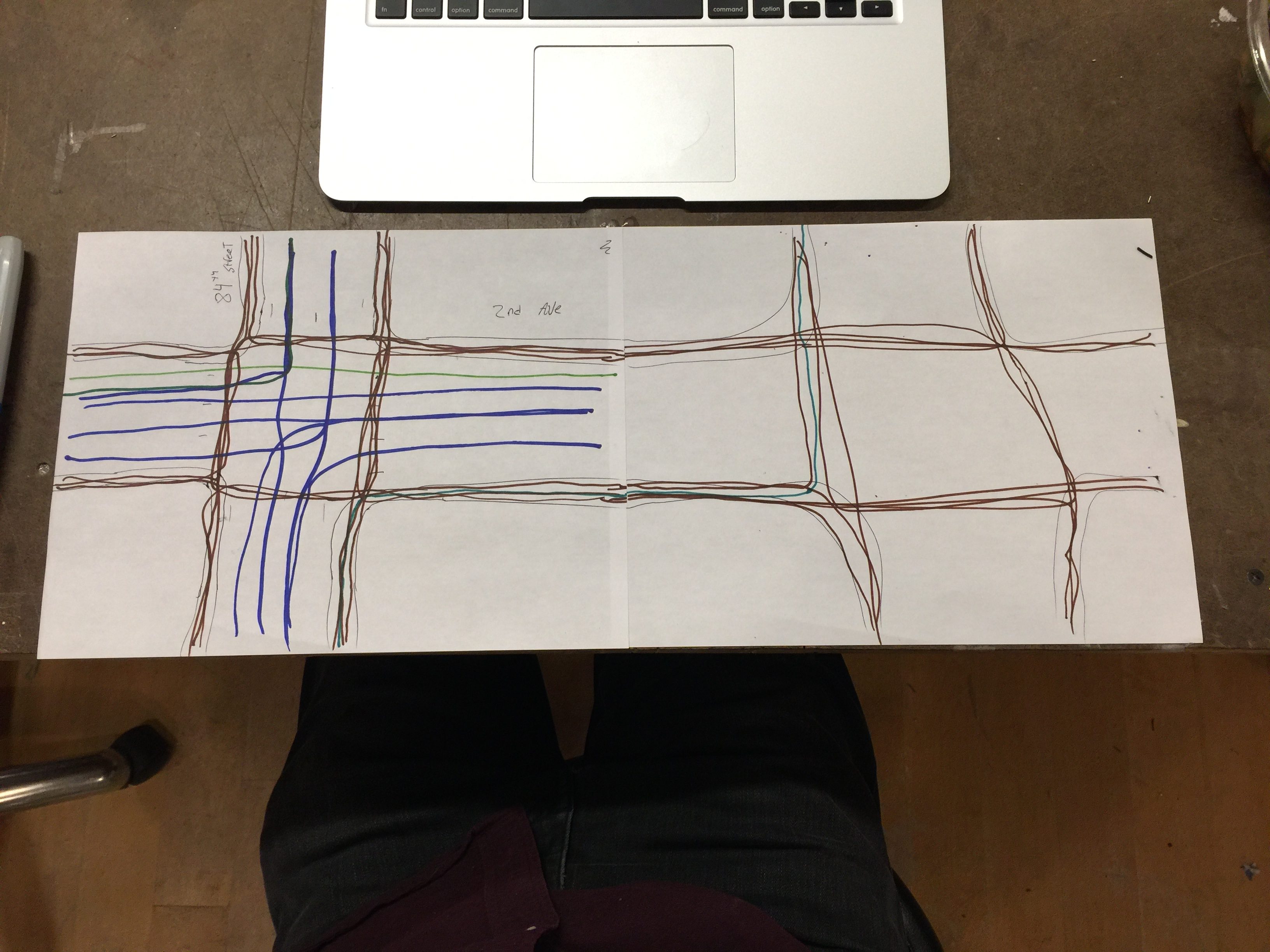
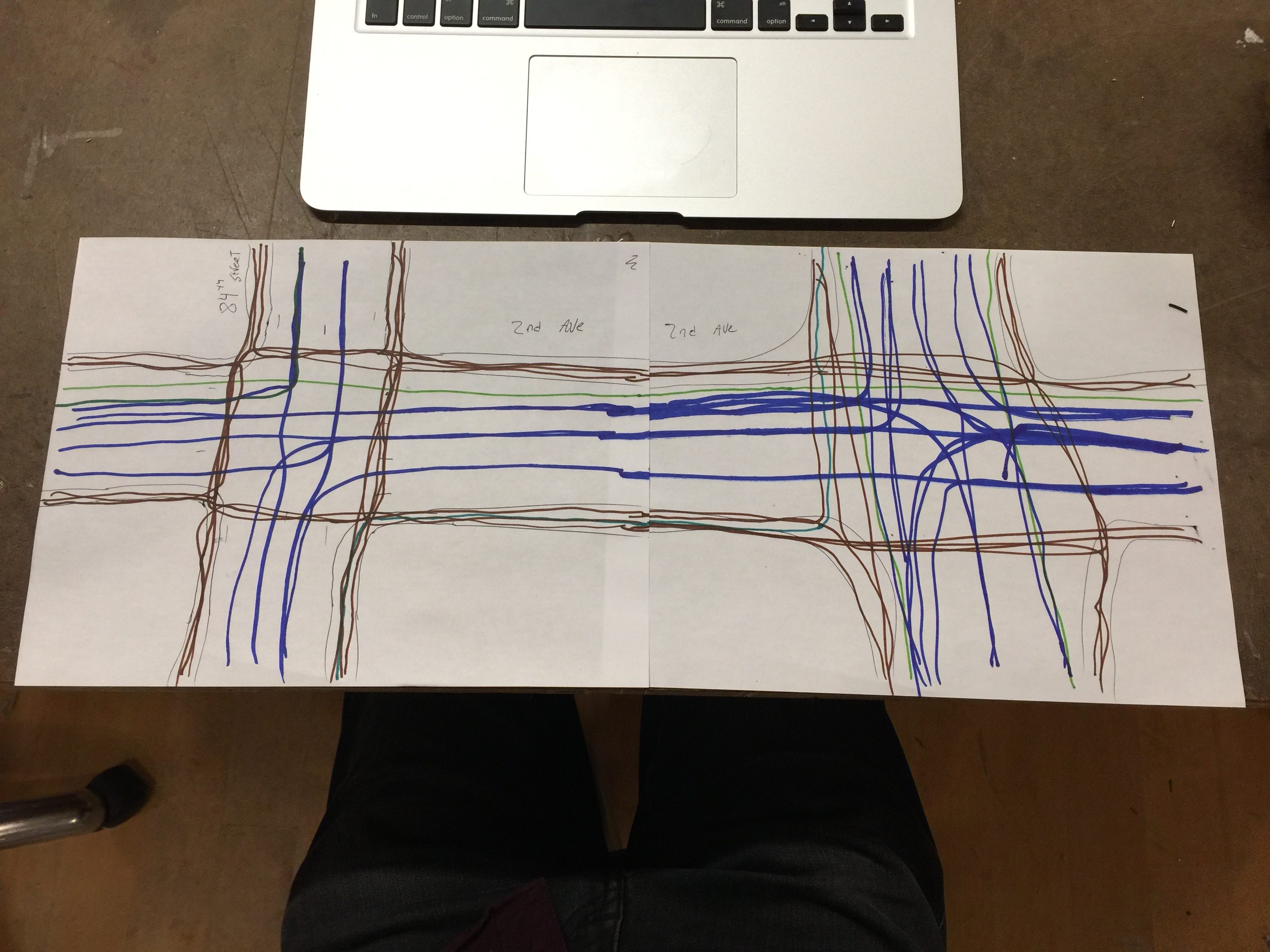
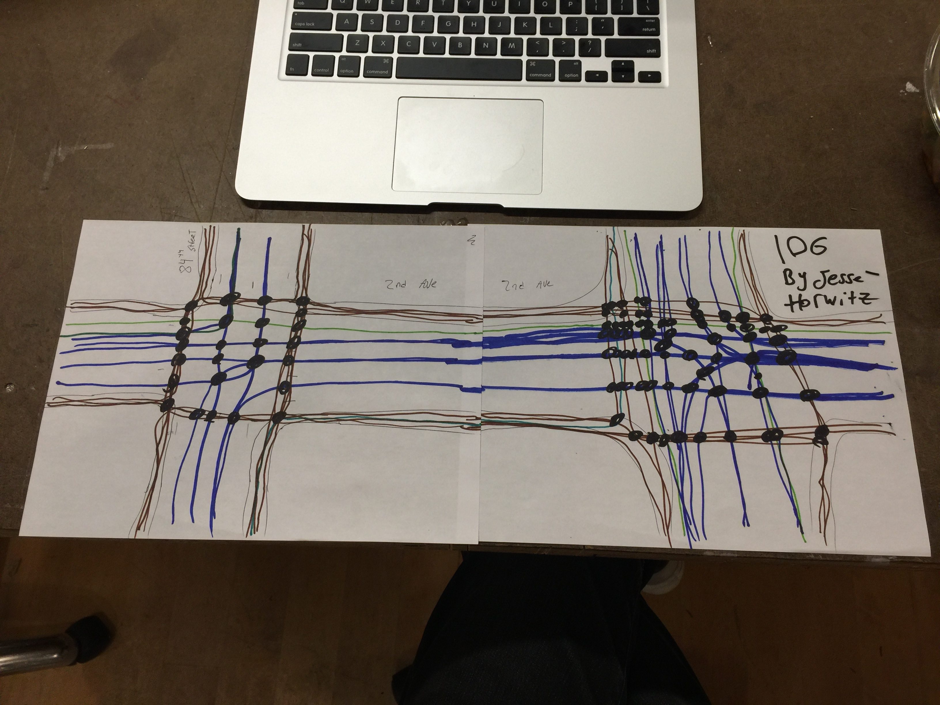
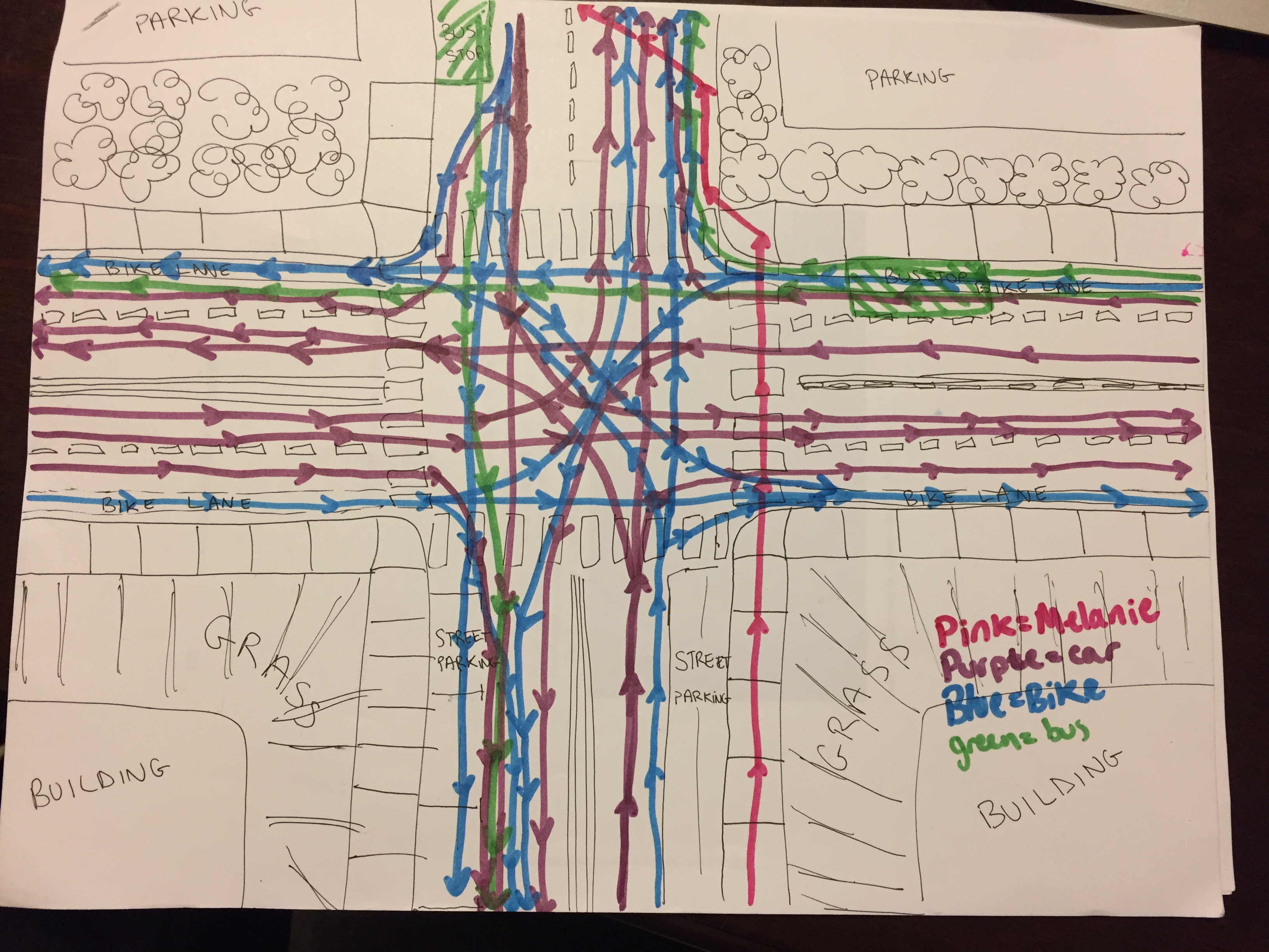
This week I created a set of instructions for a drawing and sent it to three friends. The goal of this activity was to produce a meaningful representation of the conflict points in our transportation system. Ultimately the person following these instructions ends up with an original aethstetic work as well as a functional way of quantifying the failure points of a local system.

The Instructions:

Grab a sheet of paper, a pencil and a few colors to draw with. Think of a route you know well; maybe this is your commute, or the way to a friend’s house. Think of the busiest intersection you passthrough on your way, particularly one that involves multiple modes of transportation ( i.e. cars and buses or pedestrians and bikes, etc.). Using a pencil draw a rough top down view of this intersection with each right of way, route, road, or path extending to the edge of the page. Include things like sidewalks and multiple lanes of traffic and make sure to label each of these corridors in the empty spaces where buildings, fields or parking lots might be. Using a unique color draw your typical path through this intersection from one edge of the page to another. Using a different color for each mode draw all of the possible paths through the intersection from edge to edge. Draw a new line for each distinct path (its ok if they overlap a little).

(Optional) Continue your route on another page. Using a new sheet of paper repeat this process for the next or previous intersection you passthrough on your route. Try to maintain the same color scheme and scale as your original drawing but continue from memory.

Erase the pencil and draw a black dot over any points where two or more lines cross. There may be a lot of these. When you feel that you’ve finished, count each black dot and title your work with the total.


Results:

Melanie #1
Melanie #1
Melanie #2 Final
Melanie #2 Final
img_2030
Nick #1 Final
Jesse #1
Jesse #1
Jesse #2
Jesse #2
Jesse #3
Jesse #3
img_3409
Jesse #4 Final

I wanted to do something like this because of a frustration I have with our current infrastructure/transportation paragdime. In my opinion our transportation system mainly relies on intimidation and harassment to achieve a semblance of efficiency. I often think about how this could be re-engineered but given the scale and scope of this problem the better response may be to encourage others to think with me. That was the goal of these instructions.

Art Strategies – Post #2 Aleatory, Procedural, Instructional: Life a User’s Manual by Georges Perec

After leaning about Aleatory, procedural and instructional art in class I spent some time looking into these strategies and discovered Georges Perec. Georges Perec was primarily a french writer who employed a number of constrained writing techniques while producing his novels in the 1960’s and 70’s. For example, he wrote a detective novel called A Void about “the disappearance of the letter E from the alphabet”, without using the letter “e”. Multiple sources have suggested that his writing is often autobiographical and the decision to remove the letter, while kind of comical given the plot of the book, may also refer to the loss of life during the holocaust and his parents related deaths. Perec stated that his writing concerned “a passion for the apparently trivial details of everyday life, an impulse toward confession and autobiography, a will toward formal innovation, and a desire to tell engaging, absorbing stories”, which suggests that he viewed these potentially gimmick-y/arbitrary writing constraints as a source of creativity, narrative attention and expression in itself. He may be best know for his collection of “novels”, Life a User’s Manual  which uses a series of complex constraints to tell the story of an entire apartment building at a single moment in time.

Georges Perec
Georges Perec

Life a User’s Manual has 99 short chapters, each of which centers on a specific room within a Paris apartment building. One of the primary constraints Perec uses concerns the progression of rooms and chapters in the book which is based on a graphic representation of the building (itself an object in the book). Perec sketched out the fictional building and imagined that the 100 rooms of the building represented a grid, he then traversed this grid following the path of a knight on a chess board. In addition, he developed complex rules regarding specific objects, ideas, characters, references and even falsehoods that would need to appear in each room/chapter. The central plot of the book revolves around a character named Bartlebooth who constructs an intricate life plan to avoid boredom, only to fail due to the complexity of his own design. This character’s death comes at the end of the book which both prevents him from completing his life’s goal and allows Perec to avoid the 100th room/chapter which would have represented his own completion of the book’s form and constraint.

A New York Times review of the english translation of Life a User’s Manual (debuted a few years after Perec’s death) described his writing: “To read Georges Perec one must be ready to abandon oneself to a spirit of play. His books are studded with intellectual traps, allusions and secret systems, and if they are not necessarily profound (in the sense that Tolstoy and Mann are profound), they are prodigiously entertaining (in the sense that Lewis Carroll and Laurence Sterne are entertaining)”. While I haven’t read Perec’s work it certainly does seem profound to end such a formalistically complex book with a sort of double statement on the failure of complex human systems.


Works Consulted:

http://www.dalkeyarchive.com/reading-georges-perec/

http://www.nytimes.com/1987/11/15/books/the-bartlebooth-follies.html?pagewanted=1

https://en.wikipedia.org/wiki/Life_a_User%27s_Manual

https://en.wikipedia.org/wiki/Georges_Perec

http://www.associationgeorgesperec.fr/actualites/


Art Strategies – Post #1

I thought the the intro and first two chapters of A Very Short Introduction to Modern Art did a great job of associating broader or related social systems, technologies and historical events with the changes in, and increasing popularity, of modern art over time. I thought the tension the author laid out between modern art and consumerism were particularly interesting. With this in mind I would say that three works stuck out to me: My Bed, Bottlerack, and Monogram.

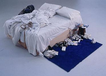
My Bed
My Bed

My Bed was one of the first works I looked up when doing the reading and it was exactly what “modern art” conjures in my mind, which is why the author was using it to make a point. However as I kept reading I thought back to this work and how it clearly fits into the cannon that the author describes. It certainly seems to challenge “the public” with the idea as art itself and operates a sort of collage of mass produced human comfort goods (in a kind of iconoclastic way). Given that the work refers to a period when the artist was very depressed I thought the author’s notion that in “modern art”, “the complacent tyranny of ‘reason’ could be challenged and the floodgates opened to those unconscious drives whose acknowledgement … could make modern human beings whole”, applied nicely.

bottlerack
bottlerack

I had seen works by Marcel Duchamp before, definitely “fountain”, but this stuck out for me because I hadn’t really considered this kind of work in the context it was created. One perspective I’d never really thought about is interaction between formalist or naturalistic painting and the emergence of photography. I had always heard the story of industrialization told from the perspective of a shoemaker, or some other craftsperson, who transitions from their craft to working on an assembly line in a related factory – I understand now that a similar transition occurred in the arts. Bottlerack now makes me think of a modern artist as something like a worker on an assembly line, attaching discourse or meaning to the objects that come before them.  Reading further that the original was “mistaken as garbage” but that “replicas resi[de] in prominent museums” also seems to further the idea that “‘modern art is more a product of its discourses than of its vulgar artificers”.

monogram
monogram

Lastly, monogram. Monogram is different from My Bed, or bottlerack in that it doesn’t really flaunt ordinary consumer goods in the same way. Instead it seems to be focused more on its own highly specific (or unique) objecthood. However, I think that the scarcity of works like this still has interesting economic implications. In a market comprised of wealthy patrons and often intentionally esoteric and singular works it’s not hard to understand why critics would be concerned with avant garde art as sort of “theme park”.


Sources :

Modern Art: A Very Short Introduction – David Cottington

http://www.rauschenbergfoundation.org/art/art-in-context/monogram

https://en.wikipedia.org/wiki/My_Bed

https://en.wikipedia.org/wiki/Bottle_Rack