This week we were asked to look more closely at signage around NYC in order to identify what makes a good sign vs. a bad sign. The first sign I wanted to share was this one that hangs in multiple places around the 3rd avenue & 60th street intersection (right in front of Dylan’s Candy Bar):
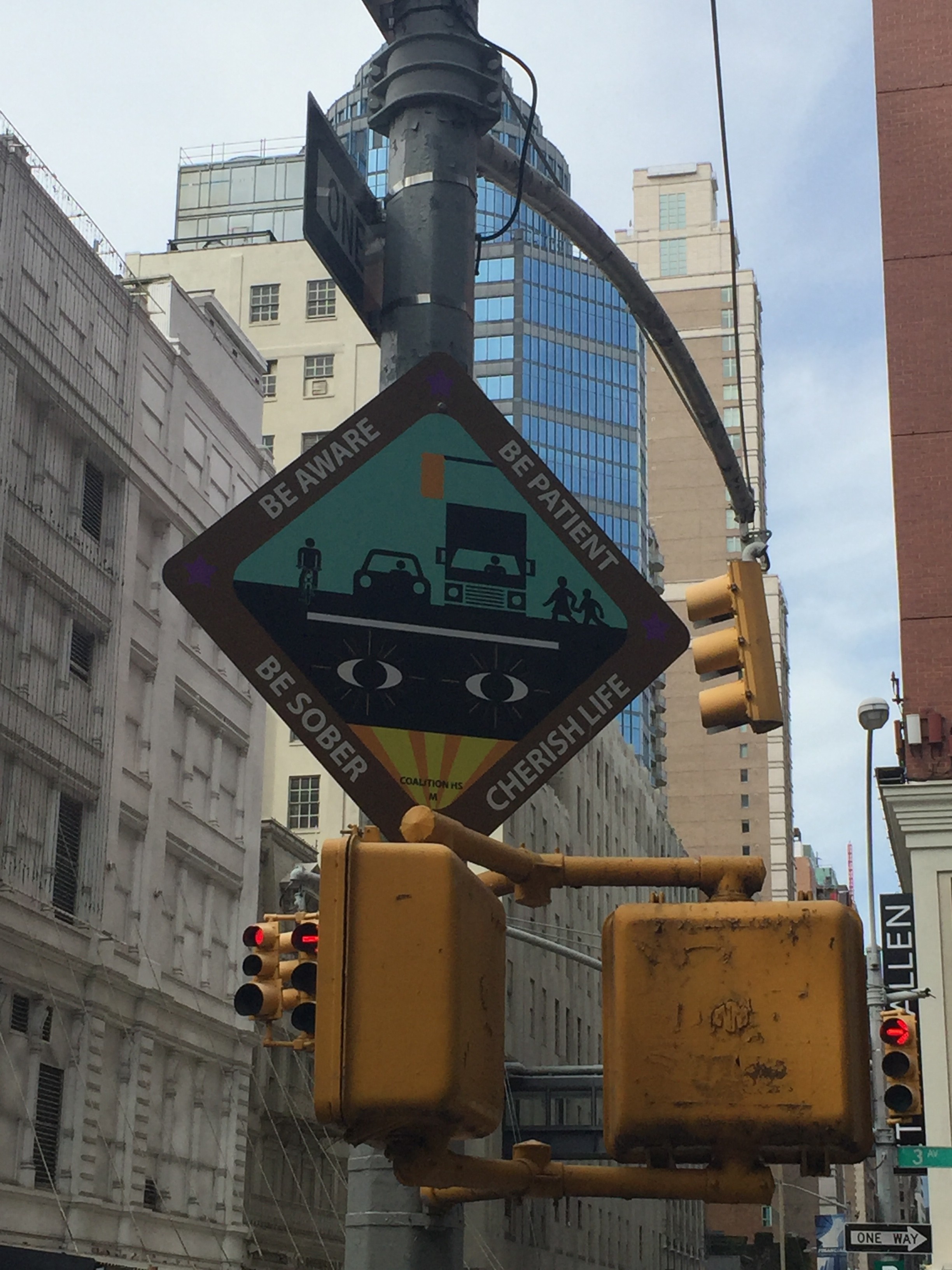
This is a fairly dangerous intersection because there is a lot of bus, truck, and pedestrian traffic moving around. The proximity to the Queensboro bridge, a handful of express bus stops and the Lexington ave – 59th street subway station produces overcrowding on all the transit infrastructure here which unfortunately seems to make most people more aggressive in their movement. To make matters worse Dylan’s Candy Bar generally caters to busloads of kids at a time and has very little sidewalk space to support this. It makes sense then that the city or some organization put this Be Aware, Be Patient, Be Sober, Cherish Life sign around this intersection. However I think this sign does slightly worse than nothing to help the situation. First of all the most basic problem is that it is oriented towards a building rather than at any lane of car or pedestrian traffic. Cars can absolutely not see this sign but its height, size and language indicate that it was meant for drivers. Though even if it were oriented at the cars I doubt it would do much besides add a distraction from the intersection they should be focused on. The red (I’m colorblind) band around the sign with fully uppercase, diagonal lettering would both attract attention like a stop sign and then be totally illegible to a driver at any sort of speed. At the same time the entire center of the sign is more folk art than than information system. Overall I think this project should have been a mural or something other than a road sign.
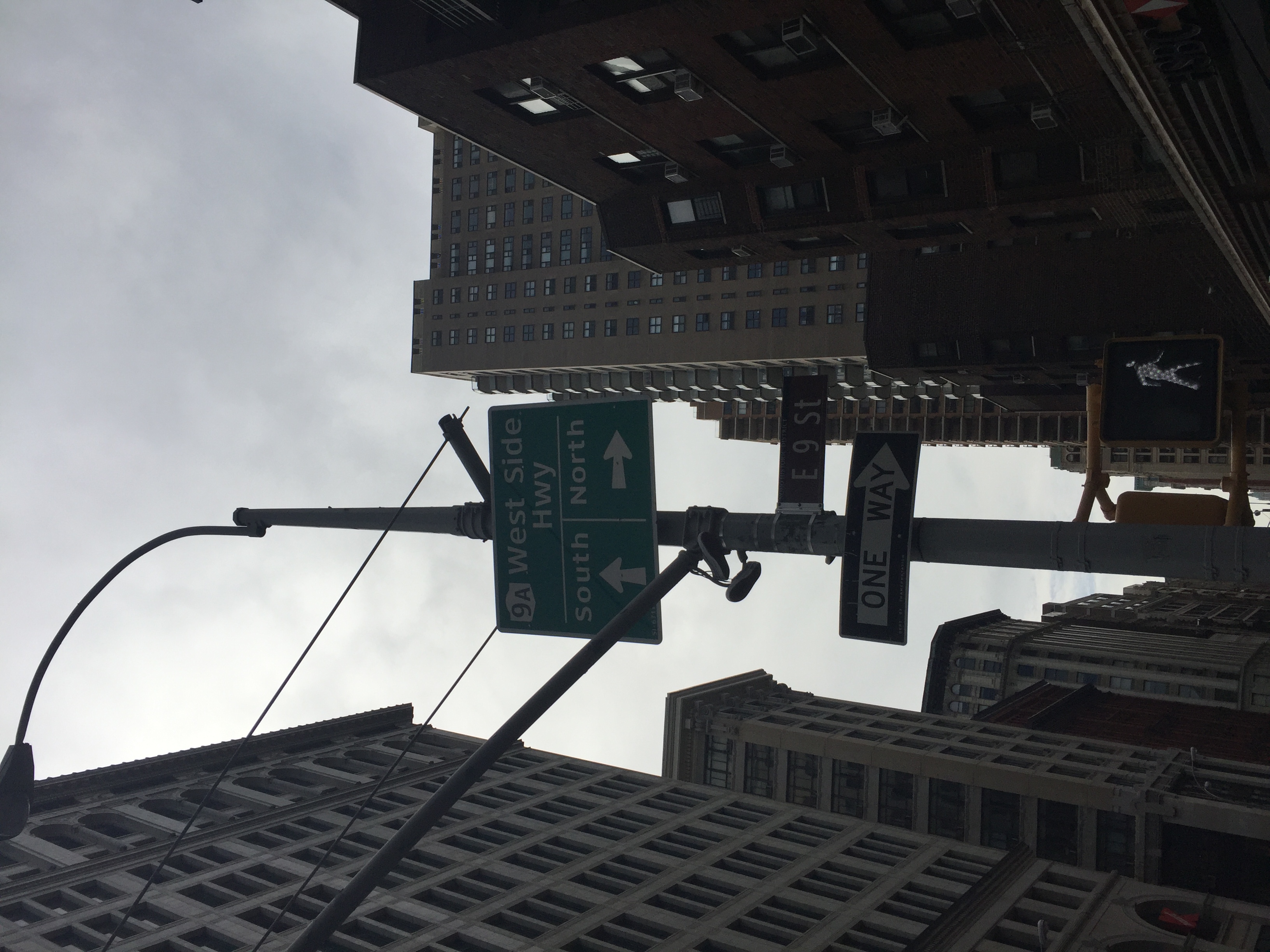
I spotted this sign on 9th street and broadway near ITP. I don’t have quite as much to say about this one. What struck me here was that the west side highway is quite far away from this sign and to me this sign indicates proximity. I think the goal here is to move traffic over to the west side before it hits Houston or Canal street but this seems to risk getting people lost in the grid. I think the problem is that it suggests that this is the point of decision making for someone trying to get on the highway. Maybe I’d have a different perspective if I drove this route.
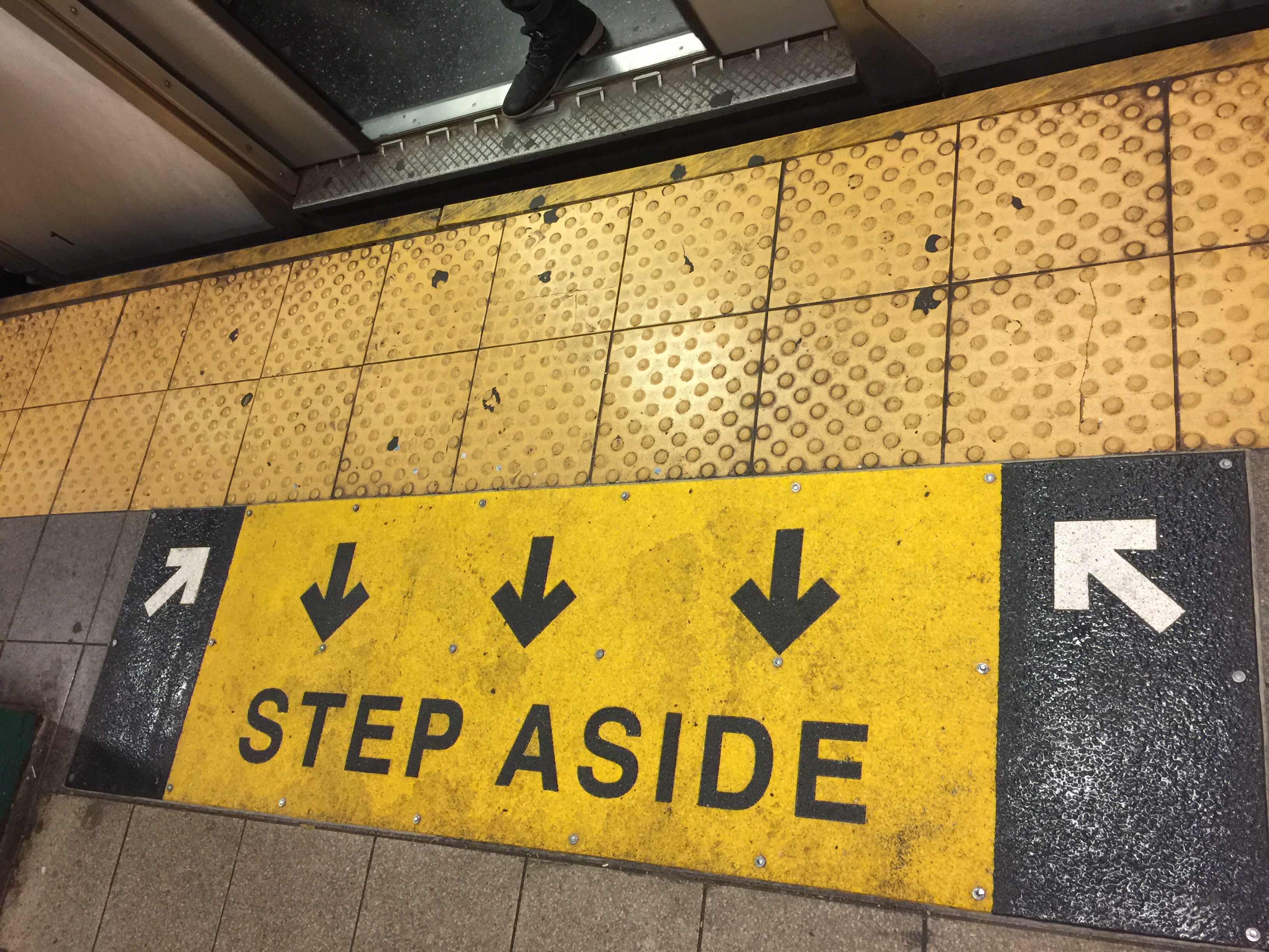
This sign is trying to convey a message that should easily be required reading for anyone within 100 miles of NYC: Let people off the train before attempting to enter. A simple concept, often flouted, leads to much acrimony. This sign is ok but I think it could be much better. The color, arrows and bold text make it clear that there is a call to action and hopefully “step aside” would make that clear. However the distance from the train confuses. This is especially true when the train is not in the station since the white arrows might actually encourage someone to stand in the worst place possible. I tried to replace or supplement this sign by adding some language to the subway doors themselves. 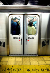 My hope is that when someone first sees the step aside prompt it becomes overwhelmingly clear what they should do when the train finally arrives. In my mock up I wrote “stand clear” on the doors (in Helvetica) to emphasize that you shouldn’t stand in front of them, while echoing the vocabulary used in the subway announcements. I also downloaded some “sign people” from a free vector image site and placed a sign person split by the subway doors with opposing red arrows with the idea that it could convey a “people will be exiting” kind of message. Then I put a “waiting in line” type row of sign people on either side of the doors to demonstrate a good place to wait as others exit the train. I considered some more text and other symbols but in the end I thought a simpler message would be best, especially in the context of a train that is trying to arrive and depart swiftly.
Finally, I found a sign I liked.
 I liked this series of signs because of the way they communicate distance. This is on the Grand Central platform of the 7 train, which is one of my favorite stops in NYC. The distant places are high up and somewhat father to either side. Although this may in some cases indicate greater importance I think here it effectively tells you that you need to go around these staircases to get the escalator, for instance. Meanwhile as you approach the staircase the smaller sign become the only one visible and clearly labels where the staircase goes without confusing it with the messaging on the larger higher level. I liked this approach because most people walking down this platform have plenty of time to decide where there going and with these signs the information becomes available as you need it. I have some issues with the exact words and uses for these sign points but overall I thought the system used here was cool.