Part One: We were asked to look into a logo that we liked so I chose Bucky badger, the mascot of the University of Wisconsin.

I know a lot of people from Madison, Wisconsin and they all have some strong feelings one way or the other about this character so I thought it would be a good logo to read up on. While Madison had a mascot as early as the 1930’s the badger named “bucky” or “Buckingham U Badger” was developed in 1940 by a commercial artist named Art Evans from California. Initially it was used primarily by semi-affiliated bookstores and institutions.
The University is a major employer and source of recreation and entertainment for Madison so even today Bucky can be found selling everything from popcorn to used cars.
Bucky also has many permutations depending on the department or sports team that is using it:
The “modern” logo came into existence in 1988 from the Anson W. Thompson Company of Los Angeles.
This logo was the first that the university itself attempted to form a trademark around which led to University Book Store v. University of Wisconsin–Madison Board of Regents where a trademark was awarded. Having been to Madison many times the badger is used as frequently as the statue of liberty is in NYC. It’s interesting that this particular logo actually started as a community development and became and official emblem of the college. In 2003 the logo was updated to give it more scalability, and to reenforce the university’s ownership of the image.
Part 2: The second part of this weeks assignment was to develop a personal logo. This was the first assignment where I really tried to learn illustrator so I didn’t get too ambitious with custom graphics. Here are some of my ideas and attempts:

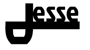
I tried to make the “J” in Jesse serve as the primary element of the logo. However I had a hard time getting things to look right with the font I selected. I ended up with two decent versions in this font (Jockey One): 
I tried this kind of logo again in a different font (Fauna One) and added my last name:

Eventually I got kind of frustrated with the “J” look so I wrote my name in Quicksand vertically with some varying stroke weights and used the spacial imbalance between my first and last name as a place for interchangeable icons from the noun project.

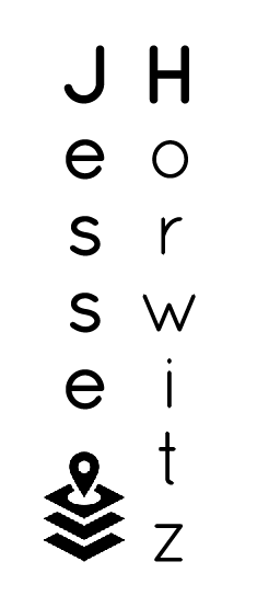
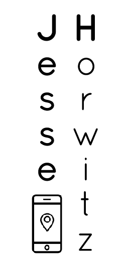

Credits for the noun project images: misirlou, Minna Ninova,