p5 and DOM | ICM #6

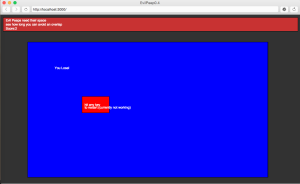
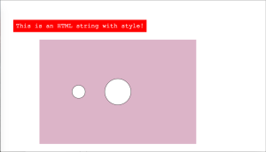
This week in ICM we were asked to do something using the DOM library in p5. I had a hard time with this but was eventually able to get some of it working. Initially I worked through the DOM tutorial and produced the styled text and canvas:

Screen Shot 2015-10-13 at 11.51.13 PM

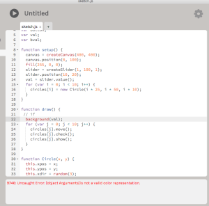
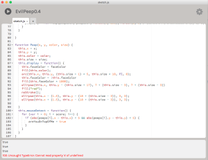
However when I tried working with DOM on my own I ran into number of problems that I didn’t really understand. The biggest issue for me is understanding where values or references can be made using DOM outside of the setup function. Here is an example of some of the errors I was getting:


Screen Shot 2015-10-14 at 9.51.13 AM


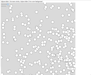
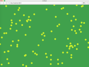
I decided to try something pretty easy so I used the bouncing circles constructor from the previous class and tried to vary elements of it using sliders. I tried a bunch of different things and most of them didn’t work. Ultimately I just used two sliders and entered some text outside of the canvas.

Screen Shot 2015-10-14 at 10.23.24 AM

It would have been nice to do more this week but I spent a lot of my time going through the tutorial and troubleshooting. At this point I think I understand the basic idea of the DOM elements and how they can be useful but so far implementing them has been difficult for me. I’m looking forward to talking more about this in class.

sketch: https://11bsouth.com/SLidersDOM/
Logos | Visual Language #4

Part One: We were asked to look into a logo that we liked so I chose Bucky badger, the mascot of the University of Wisconsin.

BuckyBadger.svg


I know a lot of people from Madison, Wisconsin and they all have some strong feelings one way or the other about this character so I thought it would be a good logo to read up on. While Madison had a mascot as early as the 1930’s the badger named “bucky” or “Buckingham U Badger” was developed in 1940 by a commercial artist named Art Evans from California. Initially it was used primarily by semi-affiliated bookstores and institutions.


The University is a major employer and source of recreation and entertainment for Madison so even today Bucky can be found selling everything from popcorn to used cars.


Bucky also has many permutations depending on the department or sports team that is using it:


The “modern” logo came into existence in 1988 from the Anson W. Thompson Company of Los Angeles.


This logo was the first that the university itself attempted to form a trademark around which led to University Book Store v. University of Wisconsin–Madison Board of Regents where a trademark was awarded. Having been to Madison many times the badger is used as frequently as the statue of liberty is in NYC. It’s interesting that this particular logo actually started as a community development and became and official emblem of the college. In 2003 the logo was updated to give it more scalability, and to reenforce the university’s ownership of the image.


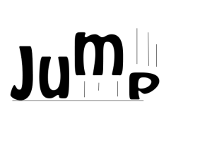
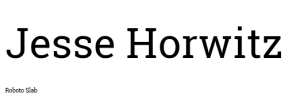
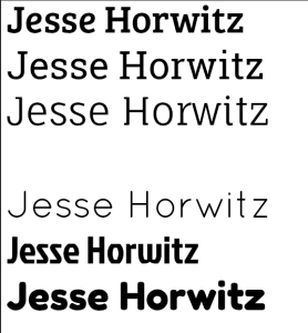
Part 2: The second part of this weeks assignment was to develop a personal logo. This was the first assignment where I really tried to learn illustrator so I didn’t get too ambitious with custom graphics. Here are some of my ideas and attempts:

Screen Shot 2015-10-13 at 12.51.56 AM

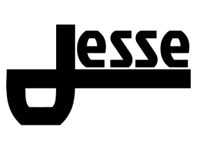
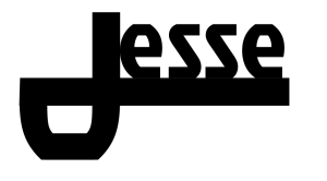
I tried to make the “J” in Jesse serve as the primary element of the logo. However I had a hard time getting things to look right with the font I selected. I ended up with two decent versions in this font (Jockey One): Screen Shot 2015-10-13 at 1.07.04 AM

Screen Shot 2015-10-13 at 1.05.16 AM


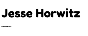
I tried this kind of logo again in a different font (Fauna One) and added my last name:

Screen Shot 2015-10-13 at 1.30.32 AM

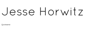
Eventually I got kind of frustrated with the “J” look so I wrote my name in Quicksand vertically with some varying stroke weights and used the spacial imbalance between my first and last name as a place for interchangeable icons from the noun project.

Screen Shot 2015-10-13 at 11.08.25 AMScreen Shot 2015-10-13 at 11.03.47 AMScreen Shot 2015-10-13 at 11.02.25 AMScreen Shot 2015-10-13 at 2.06.28 AM

Credits for the noun project images: misirlou, Minna Ninova,

Objects + Arrays | ICM #4

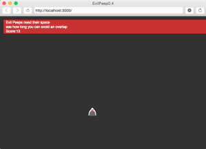
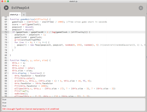
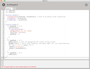
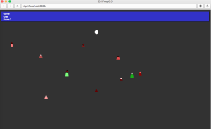
The assignment this week was to start working with Objects and Arrays. In addition we were asked to share some code with a classmate and try to integrate that into a sketch (more on this later). I initially started to “objectify” my peeps from the Evil peeps game I’ve been working on.

Screen Shot 2015-09-30 at 11.02.49 PM Screen Shot 2015-09-30 at 10.50.57 PM Screen Shot 2015-09-30 at 10.50.48 PM Screen Shot 2015-09-30 at 10.50.29 PM


At first I had some issues with where the peeps were being placed and had a difficult time replicating the functionality I had before. However, after some playing around I eventually got the peeps to recognize when another peep had been placed within 5 pixels or so which allowed me to finally make a fail screen. The key was using a for loop with a peeps.lenght limit as opposed to other values I had included. I think this had to do with the timer that I was using to generate new peeps.

Screen Shot 2015-10-07 at 9.44.19 AM

Then I started working with my parter, Jess’s code. She had a series of circles bouncing around the screen and I thought it would be cool to include that as part of the fail screen.

Screen Shot 2015-10-07 at 9.57.02 AM

In preparation I made the fail square fit into the existing menu bar and hoped that the circles could be evil peep heads that bounce around after you loose.

Screen Shot 2015-10-07 at 10.47.59 AM

Unfortunately I could only get one static circle to form before P5 would get “Uncaught TypeError: Cannot read property ‘move’ of undefined” I’m not sure why but I couldn’t get the circles/ball function to be recognized by the editor no matter how I tried to configure it. So I think this week I became familiar with constructors but theres still a lot I need to learn before I can build and implement these things easily.


Game:

https://11bsouth.com/EvilPeep0.5/

Reading Response | Pcomp #5

The readings this week emphasized sketches and the design process. I was happy to see the repeated suggestion that you don’t have to be “good at drawing” to sketch because I am definitely not good at drawing and that gave me some confidence to do it anyway. It also occurred to me that a non-verbal way of communicating ideas would be helpful in general but paticularly at ITP given the number of international students and group projects. In addition, I really appreciated the concept of local hill climbing at the expense of the “global” maxima. I feel like I’ve already experienced this in some of my ICM work, where a particular problem was wasting a lot of time only to change course and produce similar functionality in a fraction of the time. — The second reading , by Tom Igoe, also dealt with the design process and essentially asked aspiring interactive artists to realize that a truly interactive concept can’t be completely defined or contained by it’s creator. Too explicit an interaction deprives the experience of discovery and a truly two way interaction. This lesson is taught to ITP students in many cases when they walk up to the screens displaying projects in the hallways. Outside of the end of semester shows most of these screens are unlabeled and up to the casual viewer to determine the “purpose” and decide for themselves what they are supposed to “get” from it.  It’s an interesting challenge to see what can be left unsaid and still be heard.


Buxton, Sketching User Experiences: The Workbook

IgoeMaking Interactive Art: Set the Stage, Then Shut Up and Listen