Lab + Photometer | PComp #3

The purpose of this lab was to get a sense for how to program analog and digital input/output with an Arduino.

Examples shown to us in class

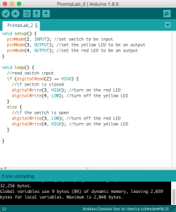
I started with the digital input example where I was able to get two different colored LEDS to alternate based on a switch button. I realized halfway through that I had switched the LEDs from what was shown in the lab but it was easy enough to change the code and have it work properly either way.

Screen Shot 2015-09-21 at 6.58.17 PM

Video-Aurdino Alternating LEDs

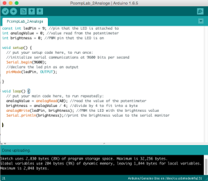
Next I worked on the analog input lab which uses a potentiometer to effect a variable as the analog input and apply a range of power to an LED via the digital output. (a portion of the previous circuit was left on the board).

Screen Shot 2015-09-21 at 7.15.09 PM

Video – Arduino Variable LED

Photometer

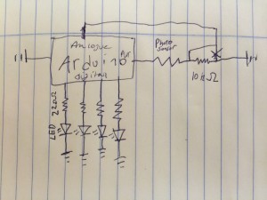
After completing these labs I decided to try to build a sort of photometer with some LEDs and a photosensor. My goal was to illuminate the LEDs in a sequence as the resistance of the photosensor changed. This meant reading an analog input and providing power to a series of LEDs via the digital out. The schematic I drew at the time looked like this:

IMG_1464

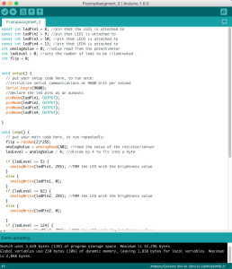
I started using a potentiometer rather than the light sensor so that I could test the programming for the lights a series of precise levels.  After some trial and error with the programing I had it working roughly the way I wanted it to.

Screen Shot 2015-09-21 at 8.32.06 PM

Video – Arduino Indicator Light Photometer

The LEDs turn on and off in sequence as the resistance changed and when the range was maxed out they all flickered to indicate that it was as high as possible. Lastly I removed the potentiometer and replaced it with a photosensor and a 10 kohm pull down resistor. I recalibrated some of the levels so that the LEDS would generally represent a range of typical room brightness and felt happy with the results.

Video – Arduino Indicator Light Photometer (2)


Observation – POS system at The Container store | Pcomp #3

Assignment:

Pick a piece of interactive technology in public, used by multiple people. Write down your assumptions as to how it’s used, and describe the context in which it’s being used. Watch people use it, preferably without them knowing they’re being observed. Take notes on how they use it, what they do differently, what appear to be the difficulties, what appear to be the easiest parts. Record what takes the longest, what takes the least amount of time, and how long the whole transaction takes. Consider how the readings from Norman and Crawford reflect on what you see.

________________________________________________

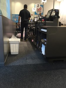
Customers wait in a line to enter a bank of registers. When a cashier is done with their previous customer they call another over (sometimes this requires raised voices and repetition). Once the customer arrives at the cashiers POS they ask the customer if they have a rewards card – most don’t and don’t want one. The costumer then begins to pile mostly large plastic containers onto the counter top as the cashier scans the barcodes with a scanner gun. Each item pops up onto the display facing the cashier and occasionally they require some form of verification or confirmation (I assume this is in the case of sales or other special circumstances). Throughout this process the cashier has to stop scanning and rearrange some of the items and bag them. Once they are done scanning they focus on bagging and let the customer know they can pay. This is the trickiest part because the variety of payment options require varying levels of interaction on both their part and the customers at the same time that the cashier is trying to bag up all of the purchased products (due to the complex and large items this is a more complicated and less repetitive task than at most retailers). Eventually all the products are bagged up and payment has been made.

Some of the cashiers vary this process by being more vocal than others – I saw one of the cashiers asking ahead of time how the customer intended to pay while others waited. Some of them would prepare bags or boxes ahead of time while others just waited between customers.

It makes sense that some of the cashiers started asking these kinds of questions (they may be told to) since a lot of time and attention is lost when things like the amount of bags you want, whether you have a rewards card, and how you intend to pay all effect the speed at which the cashier can check out customers. having to bag the products while transacting the purchases seems to make both tasks less efficient. It was clear that the easiest part of the interaction and the portion of the process that seems to be done with the most confidence is the scanning and product information retrieval.

Based on the readings from Norman and Crawford, on the whole I’d say the POS system is a good design for very general use. The method of inputing information, taps on the screen and the scanner gun, work quickly, accurately and are well suited for the task. The POS system is able to associate the barcodes with a large product database and tabulate the totals with discounts and other modifications. The machine is also fairly good at making its output clear and useful using the tough screen and the payment terminal. However, there is often confusion about when to swipe a credit card and the cashier has to do a lot of verification and reading off the screen to the customer which seems like it could be improved. In addition, these kinds of POS systems are fairly standard so most customers and employees have an idea of what to expect and how to use it. Customers know where to swipe and whether or not the payment went through and most of the points of friction seem related to additional programs the store has imposed such as the rewards card. That being said I think there is a lot of room for improvement, particularly before the customers reach the machines themselves. I think that If customers were sorted before reaching the register cashiers would be able to check people out faster and the interaction with the POS system would be more predictable and intuitive for both the customer and employee. As the customers are online they should be asked if they have a rewards card and what method of payment they intend to use. In addition customers with complaints, pricing questions, and other miscellaneous issues should be sorted out of line so that they don’t have to conduct their non-checkout business with a person and platform that are tailored for checkout. Lastly the kiosks that the POS systems sit on should be rearranged so that a dedicated employee can bag things up while the checkout is happening separately. Basically I think the POS system is very good at checking people out but it is not quite so good when this activity is coupled with bagging and sorting out customer issues.
FullSizeRender

Design Analysis – The Atlantic’s Poseidon | Visual Language #1

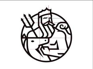
For my Visual analysis I choose to focus on an image of Poseidon as (one of) The Atlantic’s logo(s). I thought this would be a good place to start. This is a symbol I always liked and I thought that despite its simple appearance it was probably developed very carefully as the modern face of The Atlantic.

theatlantic_poseidon

colophon
 (http://wapo.st/1MEwz15)

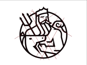
I noticed three or four grid patterns: the first I noticed was a diagonal XY grid represented by the intersection of Posdeions trident and his shoulder. The second was another rotated grid intersection at the wave and the other shoulder.

(I thought this grid might be very dense so I only included enough lines to make the pattern recognizable)

Screen Shot 2015-09-21 at 12.49.09 AM


Then I saw the horizontal and vertical grid seen on the left sided of posdeions head (y-axis) and the top of the horses(?) head (x-axsis).

Screen Shot 2015-09-21 at 12.50.49 AM

lastly, the cirlce contains most of the scene which may not be a grid but seems to “rationalize” the image and add depth as the head and trident break out of it.

Screen Shot 2015-09-21 at 12.44.18 AM

There are relatively few objects in the image and they all serve to relate the logo to the original and clearly provide all the elements necessary to conclude that the figure is posideon : the pitchfork, crown, wave, and long beard are all classically used to signify this character. I’m not sure about the horse/unicorn but I assume that’s there to either keep it consistent with the original or refers to another classical element that I’m not aware of.
Each of these elements is arranged in a series that creates a sense of depth despite the fairly uniform line thickness and the single shade of black. The horse head is layered over posideons left arm and pitch fork, while posideon himself is effectively in front of the wave.
The circle border heightens both the ease of recognizing this character, a crown and pitchfork may be enough for some people, as well as the sense of depth and action. I feel like posideon is just itching to fully emerge from the circle and attack the kinds of dense policy and cultural questions The Atlantic often wrestles with. It also allows the image to be read from left to right, so it can sit neatly above or adjacent to the text based logo or an article. It’s also worth mentioning that the thick black lines over white make this graphic easy to apply to a magazine cover with almost any other color or image underneath it while remaining distinct and recognizable.

Plagiarism readings and soundwalk | Vid+sound

Plagiarism Readings

This week’s readings dealt with the somewhat awkward relationship between creative works and an economic system based on individual property rights. Among the four works we were assigned I’d say that they each pointed out that the current system of intellectual property rights is at least somewhat out of touch with the creative process it self. These laws effectively grant temporary monopolies to producers of certain characters, stories, designs, and processes based on the idea that an economic incentive must be provided in order for invention and art to be a finacialy viable endeavor. Many of the articles we read suggested that this is problematic since creative output is often based on or influenced by pre-existing creative works. In addition it is clear that this system can be easily abused and produce results that stifle creation rather than support it. I’m not sure there is an easy “solution” to this problem now that so many rely on the system being the way it is and the inherent difficulty of quantifying originality and quality in creative works. Personally I’ve been interested in the idea of eliminating intellectual property entirely. While this may seem extreme I think it would be beneficial to the creative economy in the long run. The financial system around creation without property rights would be challenging however I think that we’ve already seen the ways it is possible to make money in an industry where traditional property rights have been eroded. The music industry which saw wholesale disregard for its intellectual property as digital file sharing took off has started to grow again for the first time in over a decade. The source of this growth is mainly music streaming services and the leveraging of influence that creators often have over their fans. I think this could be a model for other forms of art and creative property where the distribution and relationship between artist and consumer is the source of revenue rather than the selling of owned ideas that we currently support.

-Jonathan Lethem’s The Ecstacy of Influence: A Plagiarism

-On the Rights of the Molotov Man: Appropriation and the Art of Context

-Allergy to Originality

-Kirby Ferguson’s Embrace the Remix


Sound Walk – Her Long Black Hair

This was a really fun activity. I’ve heard binaural recordings before but never while walking around and never with such a direct relationship to my surroundings. The results were suprisingly convincing, or 3D sounding, and I often couldn’t tell whether certain sounds I was hearing were from the recording or the environment. I thought it was especially cool when comments the narrator made seemed to sync up perfectly with my visual surroundings. The recording was so accurate I thought it was continuing even after I took my headphones off. As I mentioned, when the recording synced up to the surroundings it had a powerful effect and this happened much more often then I would have anticipated. However, when the recording (or my walking speed) failed to sync up It did kinda take me out of the experience momentarily. This made clear that its possible to express a narrative without trying to dominate the full attention of the viewer/listener. In addition, having to find the points of reference myself made me feel like less of a consumer and more of an active participant which I liked. While I was only able to listen to the central park “Her Long Black Hair” sound walk for this week I think I may try to do the chinatown walk as well.

Evil Peeps Game Sketch | ICM #2

This week our goal was to create a sketch involving these three criteria:

  • One element controlled by the mouse.
  • One element that changes over time, independently of the mouse.
  • One element that is different every time you run the sketch.

I decided to make a game like program with this.

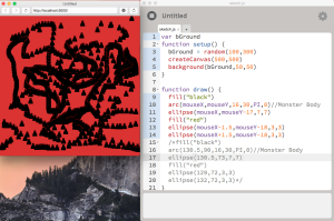
Screen Shot 2015-09-11 at 2.32.54 PM

I started by reproducing what we had done in class by creating a “drawing” type program using my ominous figure as the brush. I took the shape of this character from my previous sketch and replaced all of the X,Y coordinates with locations relative to the mouse.

Screen Shot 2015-09-11 at 2.42.52 PM

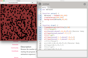
What eventually gave me the idea for a sort-of game was adjusting the frame rate. This allowed me to change the rate at which the ominous figures were placed on the screen and I used the mills() function to vary the frame rate over time. As the program continued to run the rate at which the ominous figure appeared increased.

Screen Shot 2015-09-11 at 4.58.41 PM

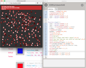
Finally, I felt that in order to make it a game I had to provide instructions and a score. I did this by drawing a rectangle at the top of the screen and placing some text over it. The score was also a function of time – the idea is that the faster the “evil peeps” appear on the screen and the longer the program has run, the more difficult it would be to place them without overlapping the figures. I also added in some more variables so that the color of the evil peeps changed somewhat randomly as the game progressed. I thought this would make the final screen look more like a crowd of individual evil peeps rather than the same thing over and over again. Right now the game works on the honor system because  if you overlap the characters there’s nothing that alerts you or causes a game over type event. I had a really good time making this and I think I have a sense for what kinds of programming tools I’d need to really make fully functioning game.